Company
Grand River Council on Aging
Date
Sept 2025 – April 2026
Tools used


Overview
A capstone redesign of the Grand River Council on Aging's web experience — making age-friendly resources easier to find, trust, and act on for adults planning for their future in Brantford and Brant County.
My Role
This was a ten-person capstone, and I contributed across the full design process.
Research — Helped plan and run contextual inquiries and moderated usability testing, then synthesized findings into archetypes and journey maps.
Information Architecture — Contributed to the card-sort analysis and the new site structure, labelling, and navigation.
Interaction & Visual Design — Diverged and iterated wireframes and high-fidelity screens as part of our shared prototype.
Accessibility — Applied accessible design standards throughout and helped audit the final designs.
Client Communication — Acted as the team's lead communicator with the client, coordinating meetings and keeping the GRCOA aligned throughout the project.
How might we design an intuitive, scalable digital solution that meets the needs of today's 45-year-olds while evolving to support them — and their community — in crafting an age-friendly future over the next 20 years?
Design Process
Discover
Contextual inquiries, an open card sort, and a competitive scan to learn how people 45+ find and trust community resources.
Synthesize
Turned research into four archetypes, journey maps, and a new information architecture grounded in users' mental models.
Design & Test
Diverged wireframes, converged on a shared prototype, and ran two rounds of moderated usability testing from mid- to high-fidelity.
Hand Off
Delivered annotated high-fidelity screens, a design system, an accessibility audit, and a roadmap for scaling the platform.
Background Information
The Grand River Council on Aging (GRCOA) is a non-profit dedicated to building age-friendly communities across Brantford and Brant County, organizing its work around eight pillars such as transportation and social participation. The problem wasn't a lack of resources — it was awareness. Many of the GRCOA's supports go underused simply because the people who need them don't know they exist.
Our primary users were adults aged 45–55+ who are just starting to think about their future, with a secondary audience of 20–40 year-olds who will age into these systems next. The existing website made it hard for either group to get what they came for: confusing navigation, text-heavy pages, no search, and content scattered across disconnected pages.
Over our capstone, our team redesigned the GRCOA web experience end-to-end and explored blue-sky features to help the organization scale over the next twenty years. Our solution focused on four areas:
- New information architecture — clearer navigation, menus, content grouping, and labelling
- Visual & interaction design — a clean, responsive design system with recognizable patterns
- Accessibility — improvements for cognitive, vision, and motor-related needs
- Scaling features — blue-sky exploration of a mobile app, an AI chatbot, and social / skills programs
Research Methods
We grounded every design decision in research with people in the GRCOA's target age range (40–55+), screened in advance for age, location, and background.
Contextual inquiries — 20 participants walked us through the live GRCOA site and their usual process for evaluating a community resource for the first time, thinking aloud as they went. These hour-long sessions surfaced motivations, habits, pain points, and how people decide whether a source is trustworthy.
Open card sort — 9 participants (5 returning, 4 new) sorted 37 content cards into their own groups and labels in Lyssna, revealing the mental models behind how people expect the site to be organized.
Moderated usability testing — We tested our prototype across two rounds (4 participants at mid-fidelity, 5 at high-fidelity), each completing four to five task-based scenarios spanning events, resources, volunteering, discounts, and community planning.
Analysis and Results
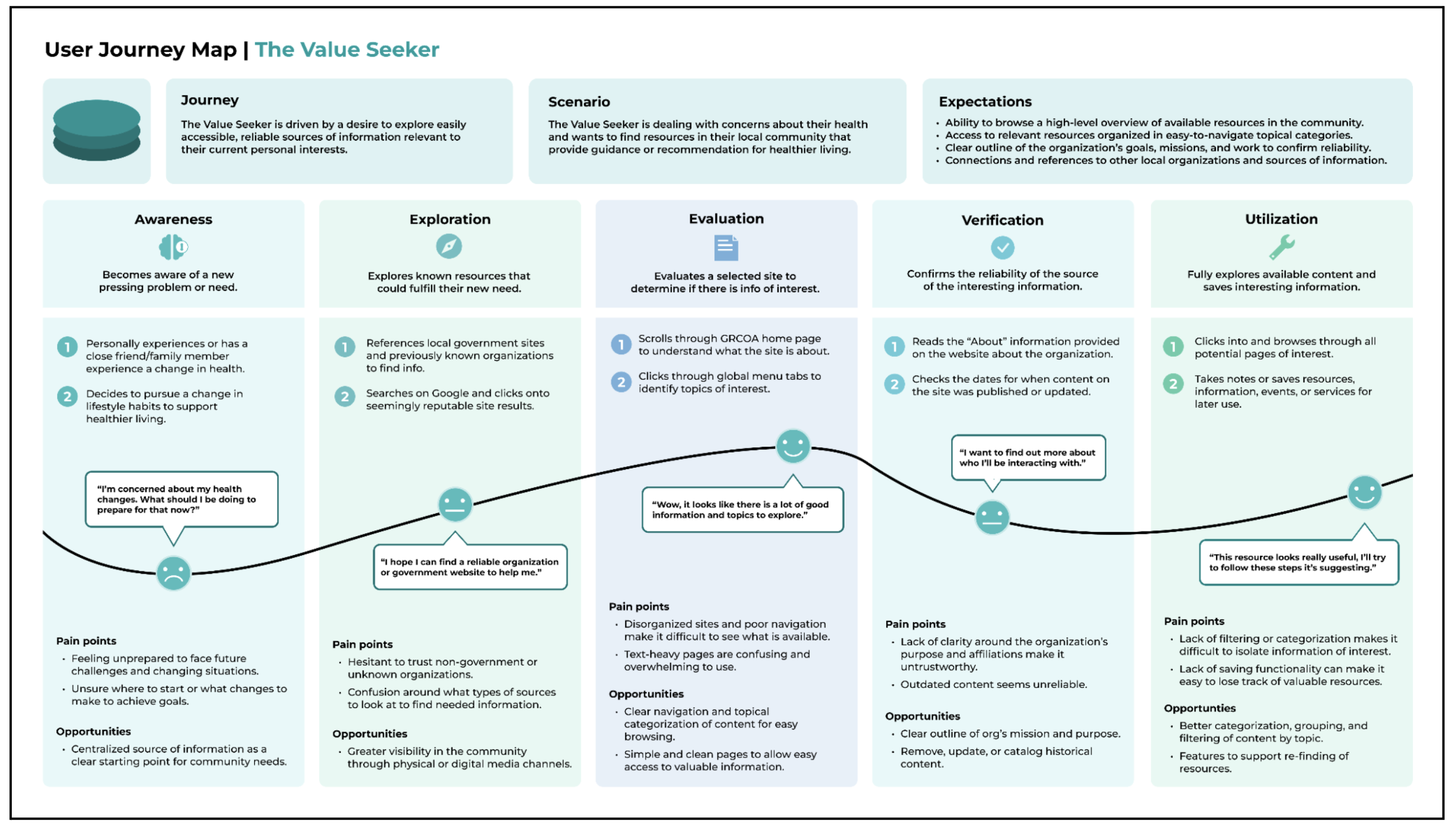
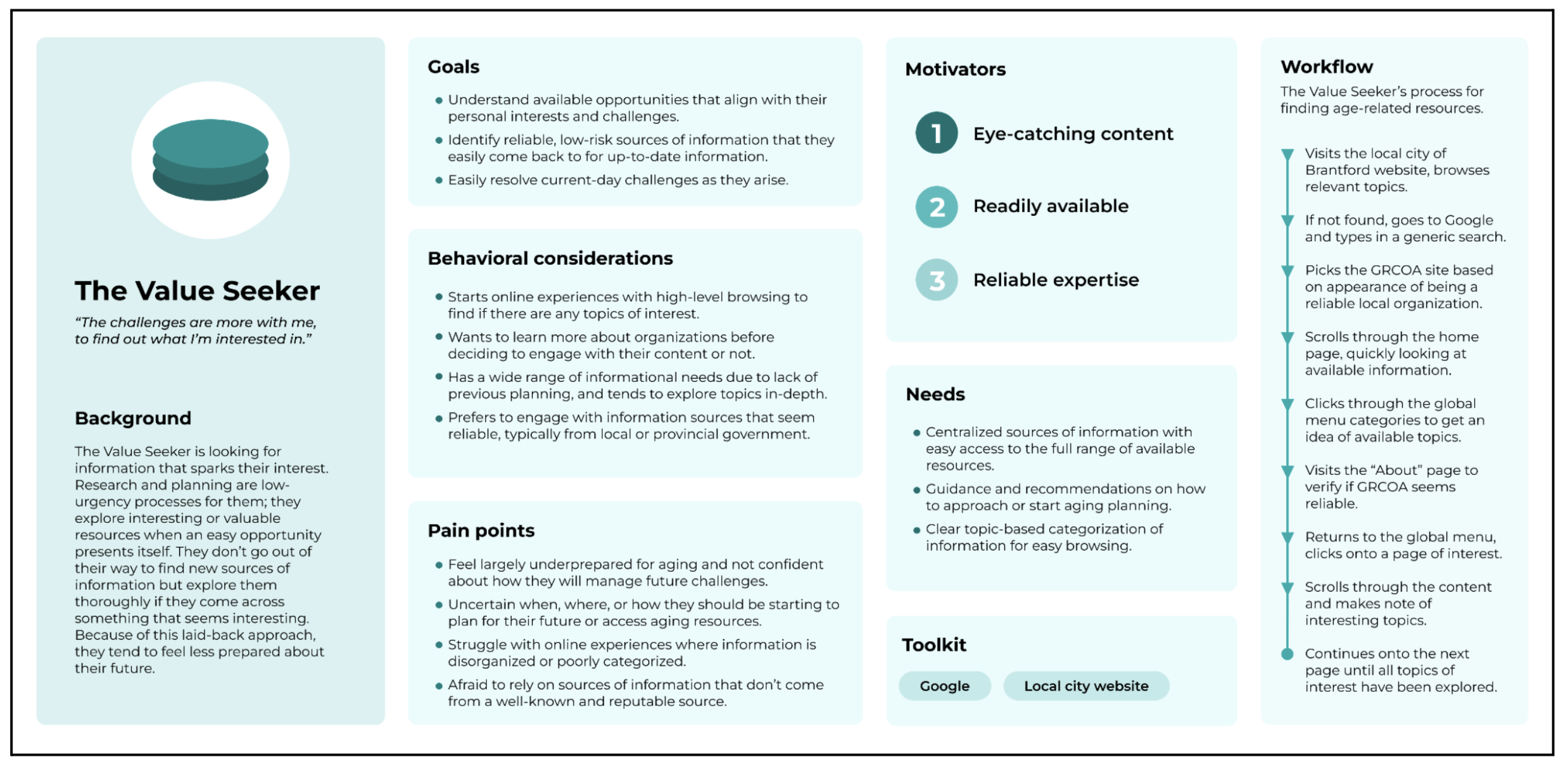
Synthesizing across methods, we defined four archetypes that captured the range of people the GRCOA serves — and designed for all of them:
- The Value Seeker — wants high-quality, relevant information to make informed decisions about their future.
- The Optimizer — time-poor and efficiency-driven; already leans on AI tools to find and summarize information.
- The Socializer — motivated by connection, events, and community, and relies heavily on social media.
- The Skeptic — needs the site to feel legitimate and professional before engaging.
The card sort exposed where people's mental models diverged from the existing structure, so we introduced a new information architecture — clearer labels and groupings, plus two new sections, Resources & Services and Community Planning — that cut clicks and made content easier to browse and search.
Usability testing validated the direction: participants completed 100% of task scenarios, with an average score of 91.9% across confidence, ease of use, and success. Remaining friction — around event registration, volunteer applications, and the 'Community Planning' label — fed directly into our final iterations.
100%
of task scenarios completed in testing
91.9%
avg. confidence, ease of use & success
Final Prototype
View interactive prototype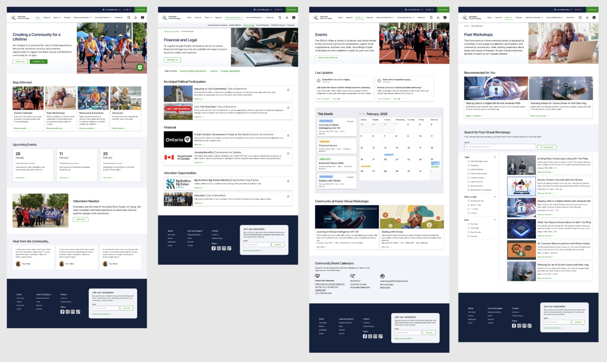
Redesigned Website
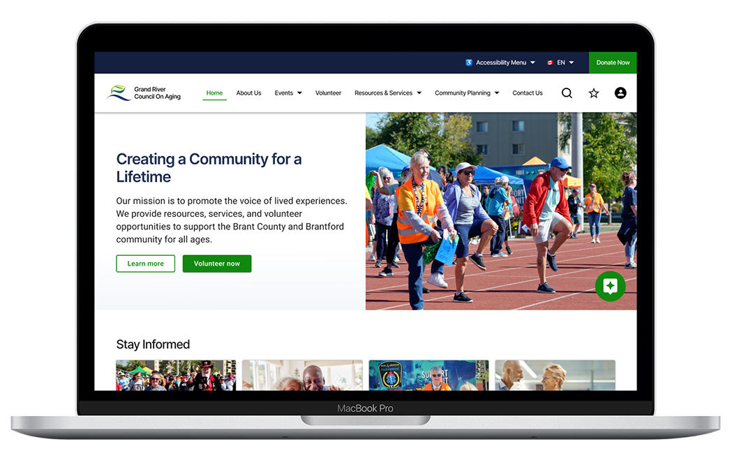
A clean, responsive redesign built on a new information architecture — reworked navigation, grouped content, full-site search, and clearer visual hierarchy across core pages like Resources & Services, Events, Volunteering, and Community Planning.
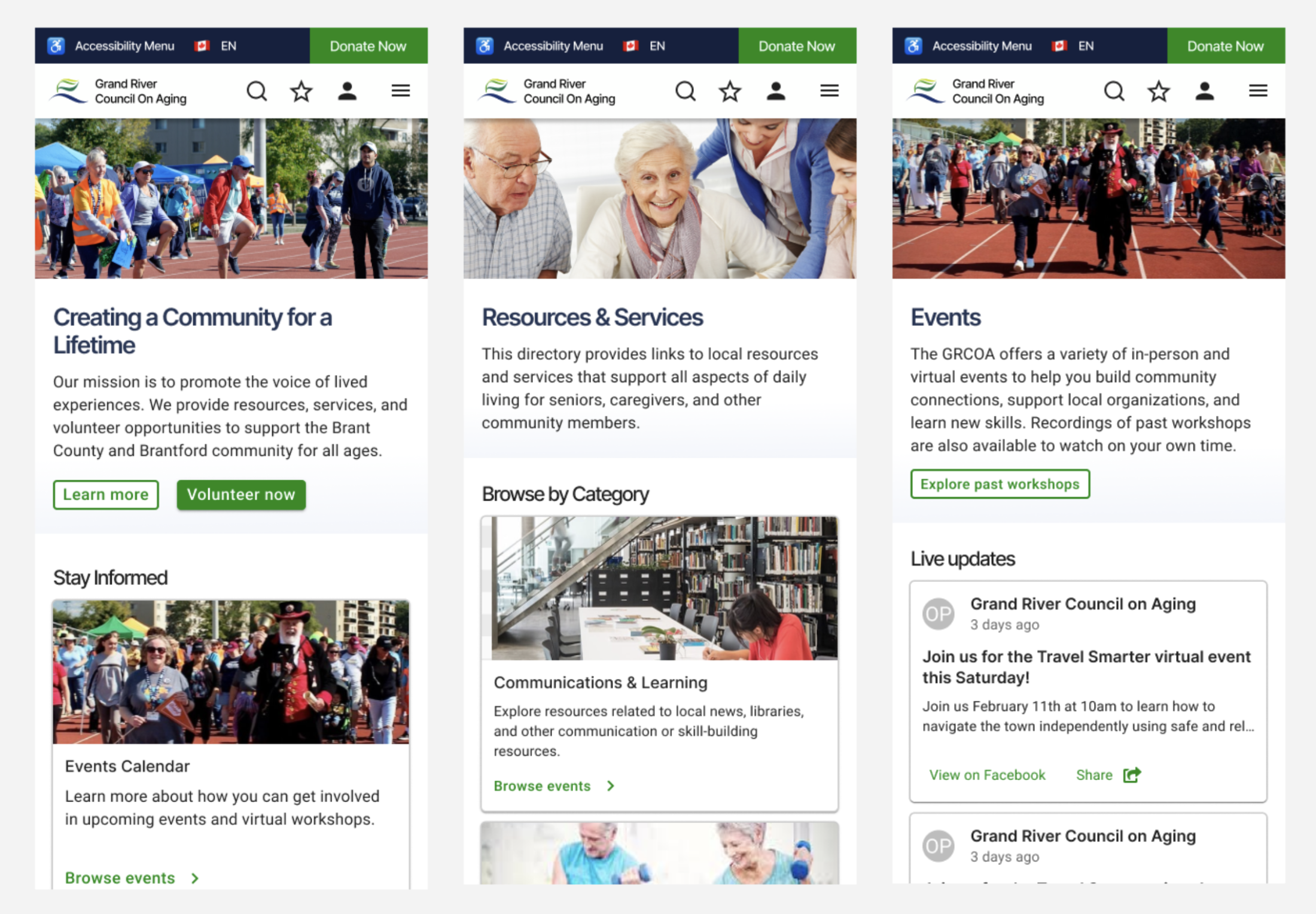
Responsive Mobile Web
The same components and layouts scaled to smaller viewports, so people arriving on a phone get the full experience — without the screen-scaling and navigation issues that affected the original site.
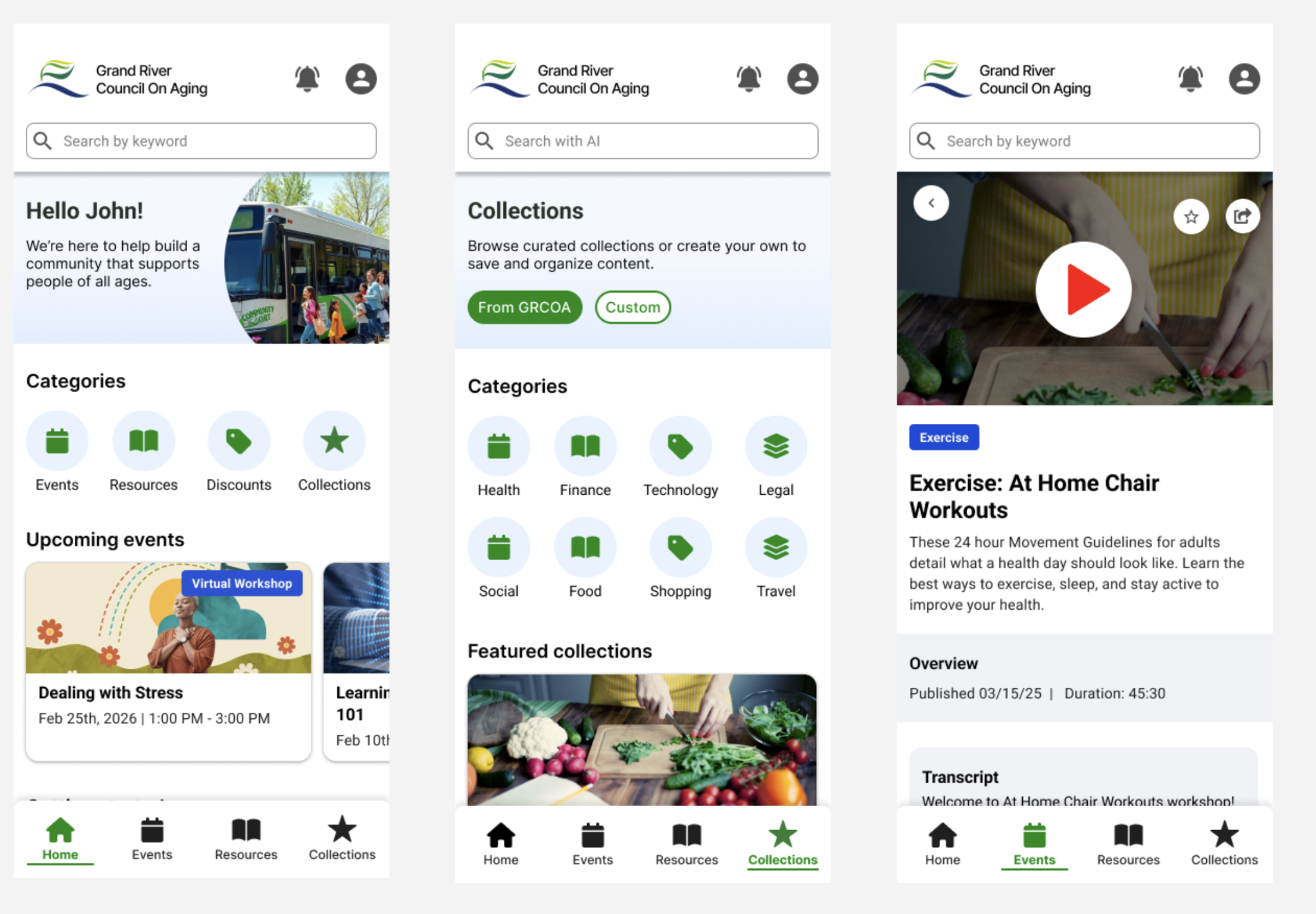
Native Mobile App — Blue-Sky Concept
A forward-looking concept for what a dedicated app could add: custom collections of saved resources, personalized recommendations, AI-assisted search, and social features that help people connect around events and volunteering.
Designing for Accessibility
Accessibility was a first-class goal, not an afterthought. We audited the final designs against a heuristic tool — built by a teammate — that blends AODA, WCAG, the Nielsen Norman heuristics, and senior-friendly design standards.
The designs scored well across general accessibility, visuals, typography, copy, inclusion, and motion, with content at 94%. The audit also pointed to concrete next steps we carried forward: clearer form constraints and a review step before submitting the volunteer application, a more self-explanatory label than 'Community Planning,' contextual help for complex components like the events calendar, and the ability to save progress mid-form.
Scaling GRCOA: What's Next
Beyond the website, we handed off a roadmap for how the GRCOA can keep growing:
- Social & skills-exchange programs — mentorship matching and skills-exchange events that turn one-off visitors into an engaged community, connecting archetypes like the Value Seeker and the Socializer.
- Social media strategy — a practical Instagram and Facebook playbook, with post cadence, engagement tactics, and reusable post, story, and reel concepts to reach both younger and older audiences.
- Developer-ready handoff — annotated high-fidelity screens with spacing, states, and a documented design system so a future team can build the vision.